Dispatch
Printing a radio station: the broadsheet design system
Why a piece of streaming software looks like a 1960s newspaper: cream paper, one vermilion ink, sharp corners everywhere, and a typographic system built on three faces.
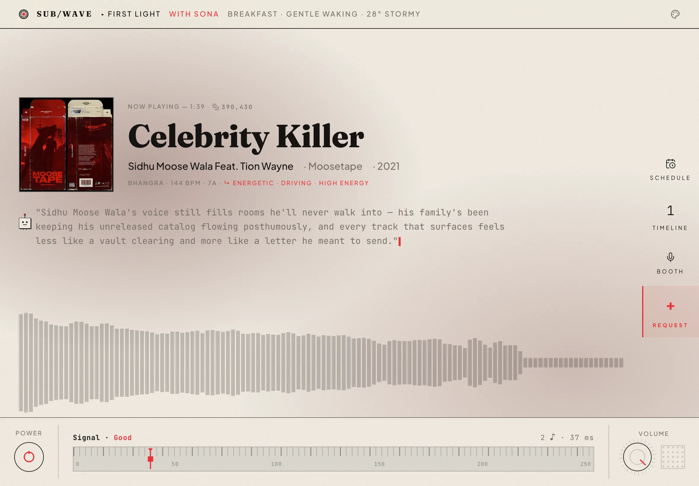
Most streaming software wants to look like the inside of a spaceship — black glass, neon gradients, a thousand rounded rectangles glowing in the dark. SUB/WAVE went the other way. It looks like something that comes off a press: cream paper, near-black ink, one hot accent the color of a printer's vermilion, and not a rounded corner in the entire application. This is the reasoning behind that decision, and the small system of rules that keeps it coherent.
Radio is print's cousin
The metaphor isn't decoration; it's structural. A radio station and a daily paper share a shape: one editorial voice, one shared edition that everyone receives at the same time, a masthead you trust, and a schedule that doesn't care about your preferences. When every listener hears the same broadcast, the interface that fits isn't a personalized feed — it's a front page.
Three faces, three jobs
The whole system runs on three typefaces, each with a non-negotiable job:
- Fraunces — the display serif. Headlines, the masthead wordmark, the now-playing title. Its optical-size axis means it's delicate at body sizes and dramatic at the masthead, the way metal type actually behaved.
- Plus Jakarta Sans — body and interface. Warm enough for the paper metaphor, neutral enough to disappear.
- JetBrains Mono — the data face. Timestamps, durations, version strings, keycaps. Anything with a number in it reads like the front panel of a hi-fi amplifier.
A typeface is a costume, but a type system is a casting director. The mistake is letting one actor play every part.
The eyebrow
The hardest-working component in the whole vocabulary is the smallest: a ten-pixel, letterspaced, uppercase mono label with a hairline rule trailing off to the right. Newspapers call it an eyebrow or a kicker. It sits above every section and does the navigation work that other apps hand to icon bars.
Rules, not shadows
Depth comes from lines, not light. A single 1px ink rule separates; a double rule announces. There are no drop shadows in the reading surfaces, because paper doesn't cast light — it absorbs it. The one exception is the paper grain itself: a fixed SVG turbulence layer at 40% opacity, multiplied over the cream in light mode and screened over the charcoal in dark mode, so the texture survives the flip.
The observatory
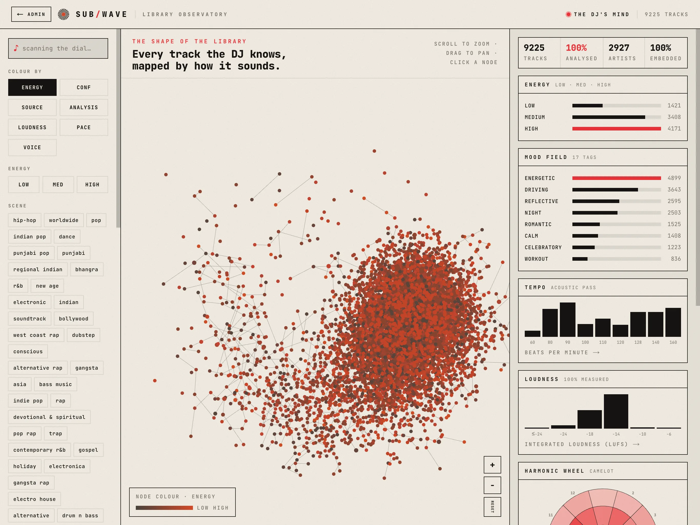
The same grammar scales up to dense, data-heavy screens. The admin's observatory view is set almost entirely in the mono face — and because every number is tabular, columns of durations align like a stock page.
The one accent
Everything gets exactly one color of emphasis: vermilion, oklch(0.62 0.22 25), the orange-red of a rubber stamp. It marks the live dot, the active tag, the drop cap, the hover state. The discipline is the point — when one ink means attention, attention becomes legible. Two accents is a palette; one accent is an editorial position.
This journal is printed with the same system — same paper, same three faces, same single ink. If it works, you shouldn't have noticed it at all; you should just have read this far without your eyes getting tired.